Features
Infographic: Amazing Film Poster Designs Throughout History
More in Features
-


All the premonitions in the ‘Final Destination’ franchise, ranked
After fourteen years away, the Final Destination franchise is back with Final Destination: Bloodlines....
-

The Best Films That Parallel Casino Games
When you spend a lot of time playing a particular game or engaging with...
-
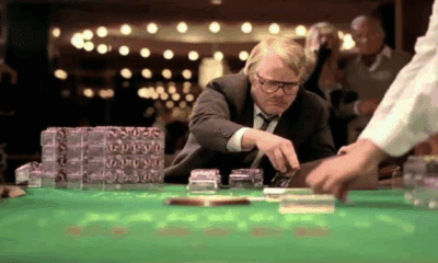

Films Based on Real Stories of Major Casino Frauds
Films based on real events often evoke vivid emotions because they seem to make...
-


Casino Tropes in Modern Cinema: Why They Still Work
Casinos have long held a mythic place in storytelling. Whether it’s the shimmer of...


